Interface δ (the fourth generation)
A fourth generation of CourseCorrect's interface is born! This includes the indisputably cool collapsable sections from the last interface but adds back the split screen from the original.
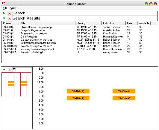
To cut back on the amount of scrolling the user has to do, the entire schedule is squeezed into however much space is actually available on the bottom (with a reasonable minimum size), while the top section can still scroll to accomadate however many searches and results the user wants to see.
Getting it to fit, however, demanded removing all the information that was there before (exact times, building name, and room number) and instead showing it only when the user hovers over a course. I may later create an option to open a schedule in a new window where it can be scrolled and zoomed and generally made to look bigger and more impressive.
Finally, gone is the giant ugly pink button to create a new schedule. Adding any sort of panel (including a new schedule) is done through the File menu.